This is a hypothetical Re-Brand that I designed for the skateboard bearings company Bones. I designed a brand guide to help viewers understand the new direction that the company would hypothetically be taking. This guide contains the new logo, slogan, typography, applications, and rules to help future designers of the company.
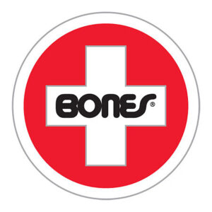
This is the current logo for the company of which I took a lot of inspiration from when it came to designing my own. The Bones brand is all about the freedom one feels while skating with their products. The current logo has a very smooth typeface that represents the smooth ride that one can feel with their bearings. This is something that I strived to have in my own version of the logo.
Bones Bearings Current Logo
WHAT I CAME UP WITH
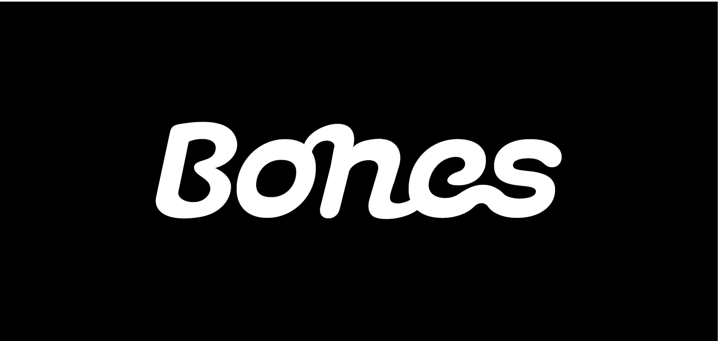
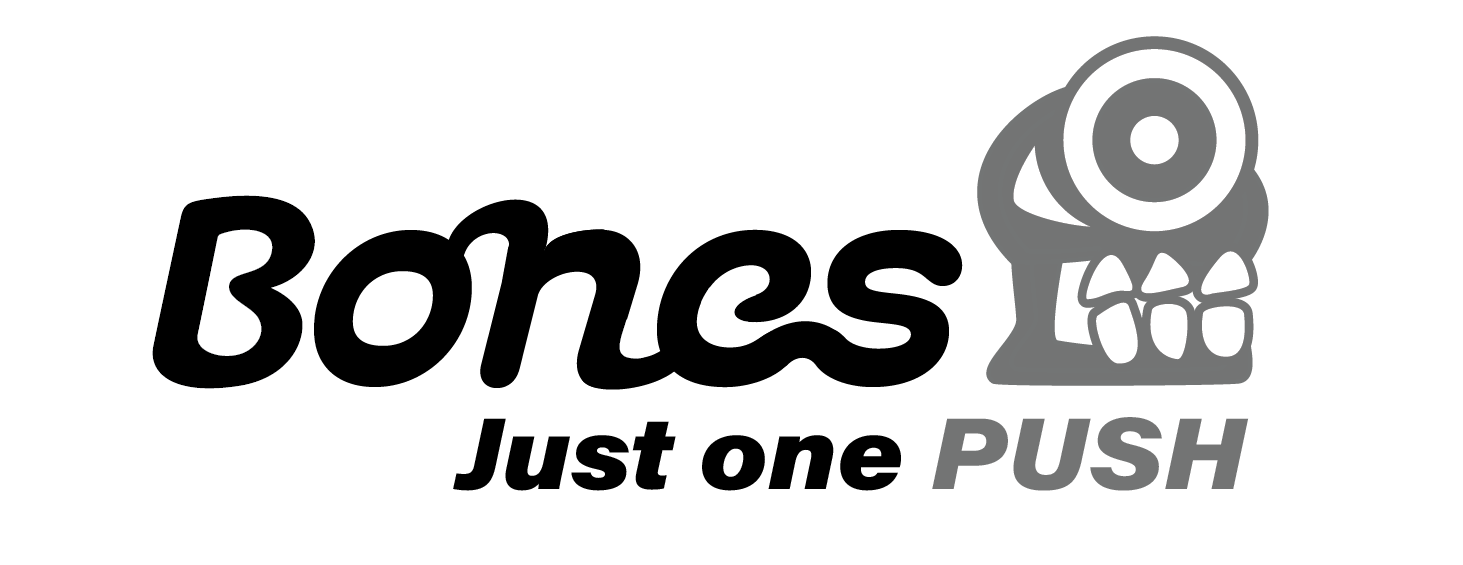
This is the brand’s Wordmark.
I made sure that the type carried the attributes of the product which are:
Smooth
Freeing
Non-stopping
This is the brand’s Icon.
For the Icon I wanted it to have connections to the product while leaning into the more “punk” nature of the skateboarding community. So I designed a skull cyclone with the eye being a skateboard wheel with the red bearing inside.
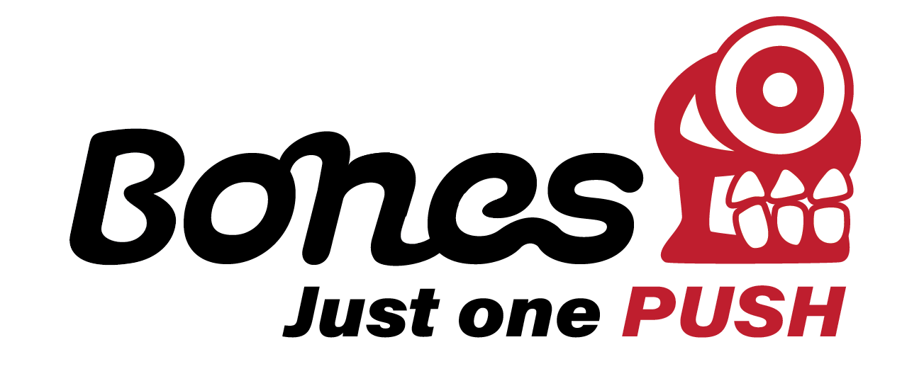
This is the brand’s Signature.
For the Bones new slogan I wanted it to be simple but also showcase the smooth ride that one gets from the bearings. So I came up with the saying, “Just one push”, which illustrates how much easier it is to skate with Bones products.
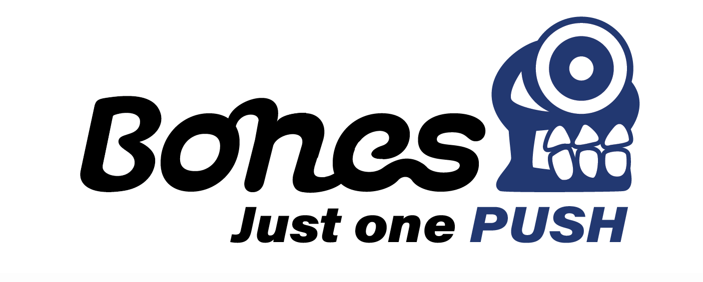
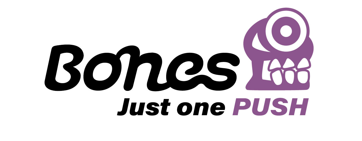
Alternate colors for the signature
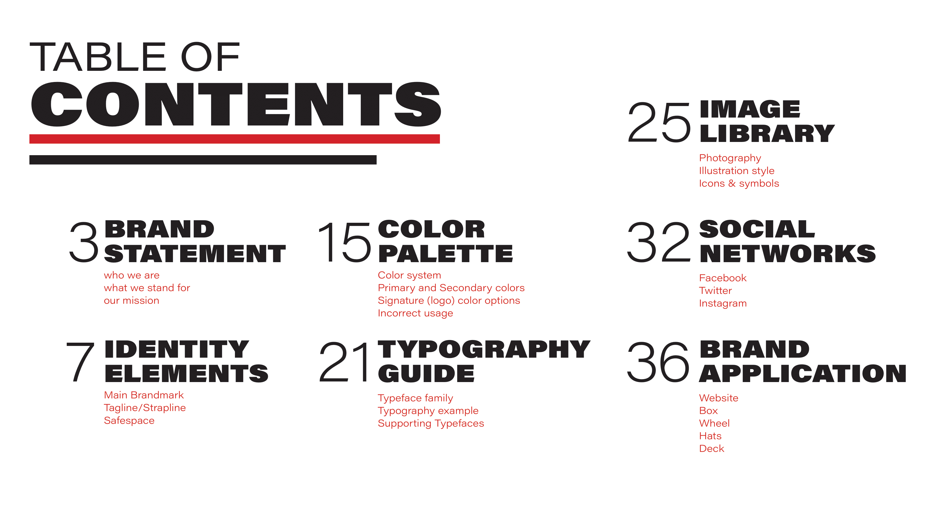
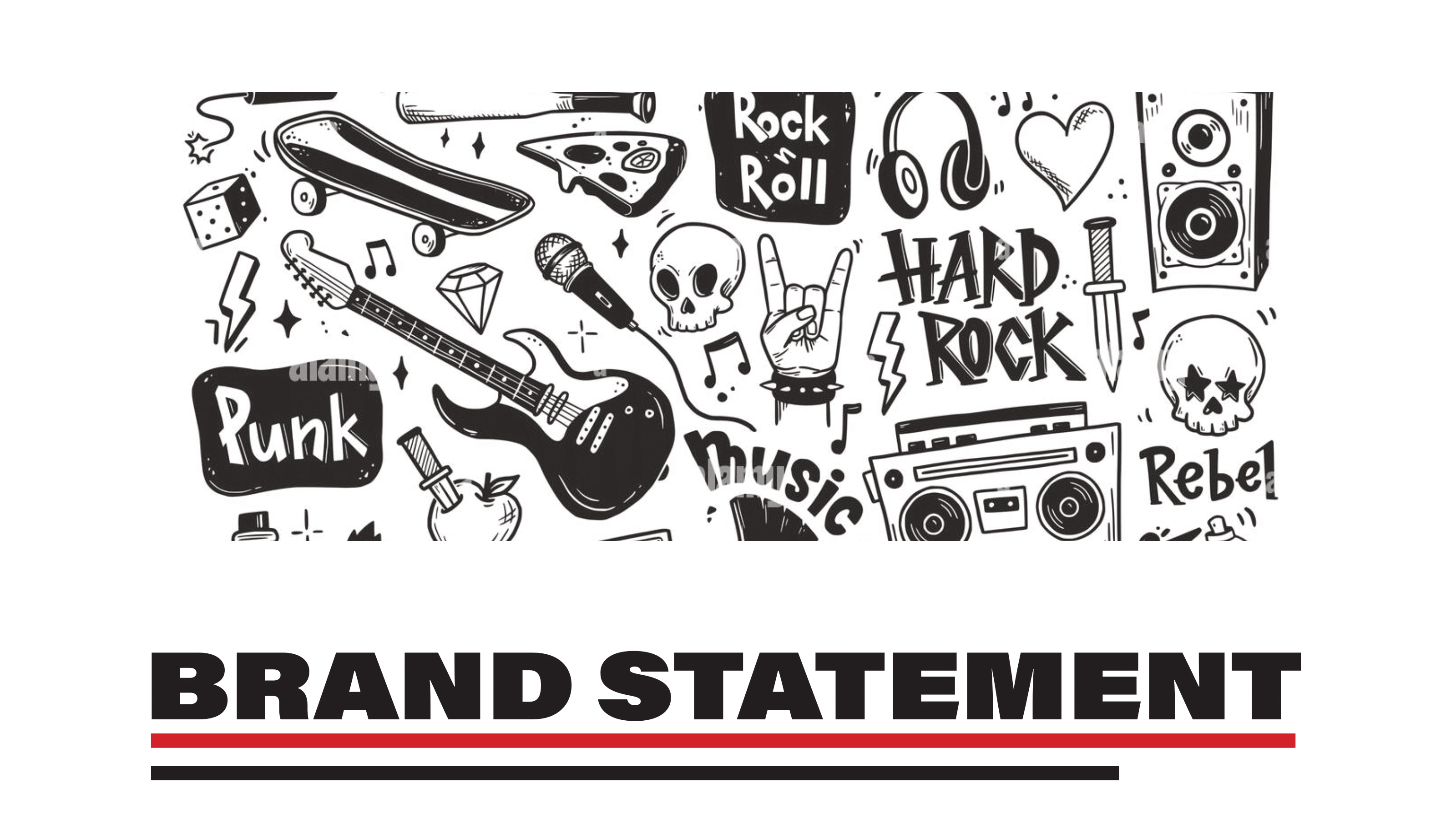
THE STYLE GUIDE
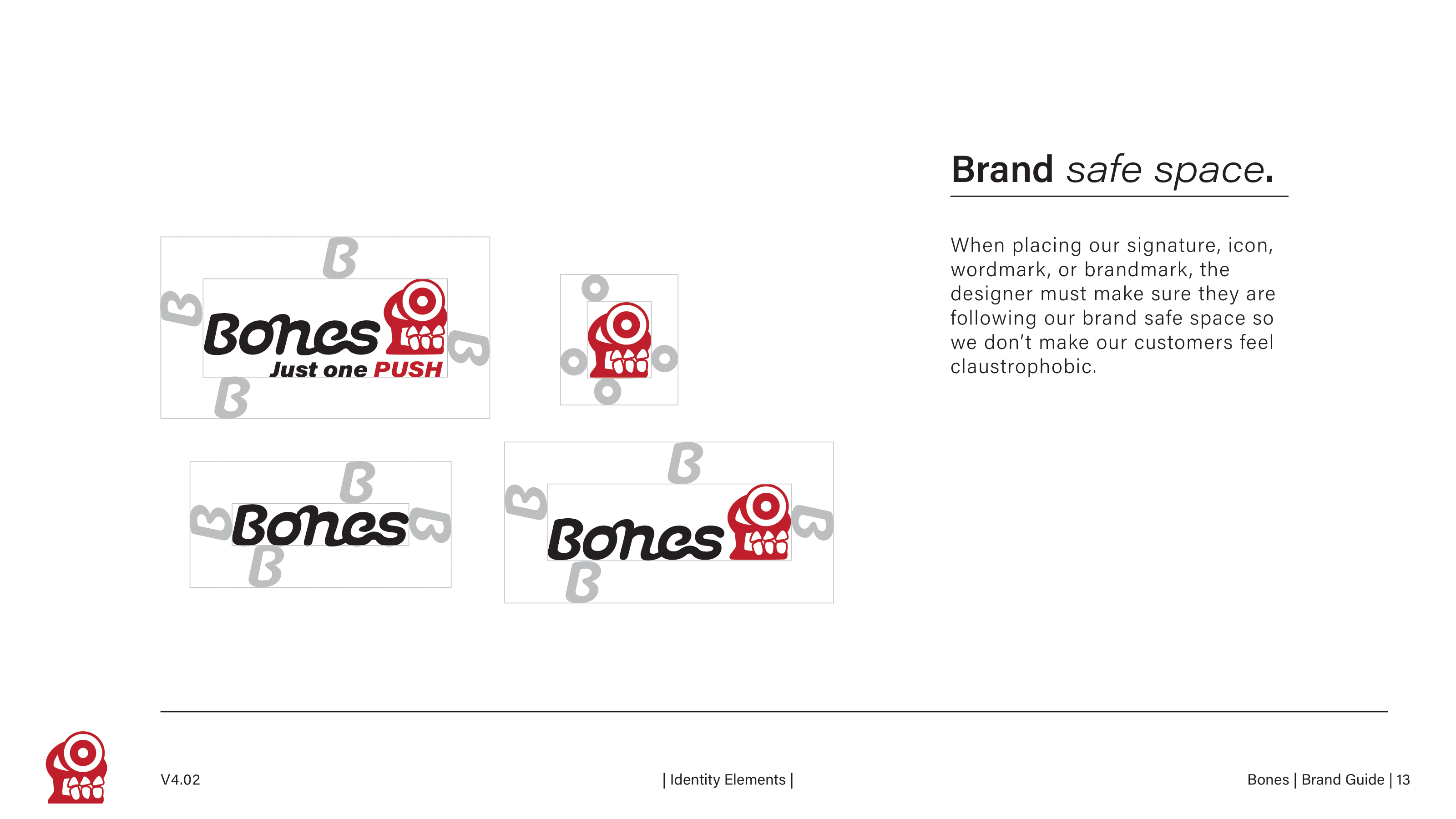
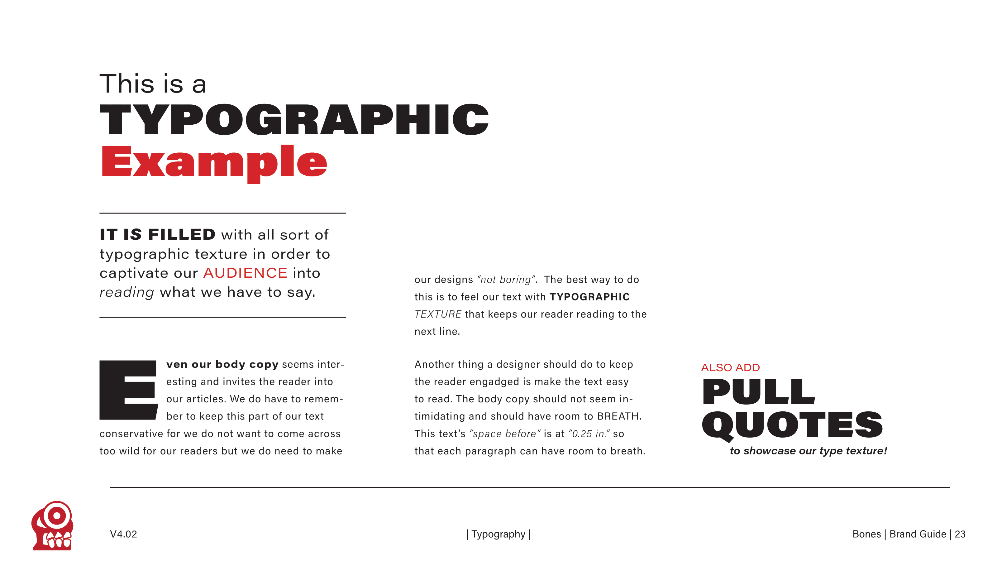
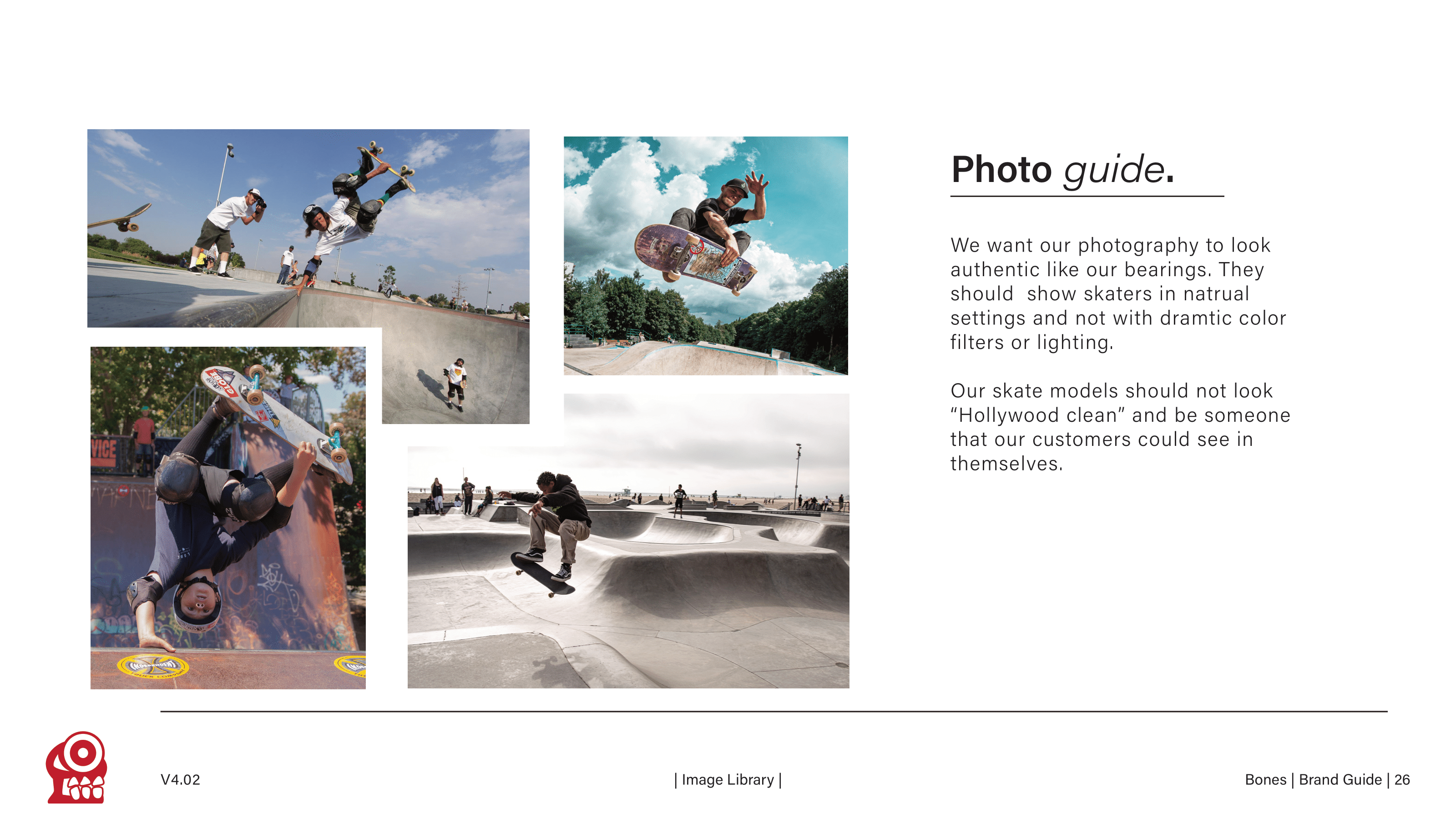
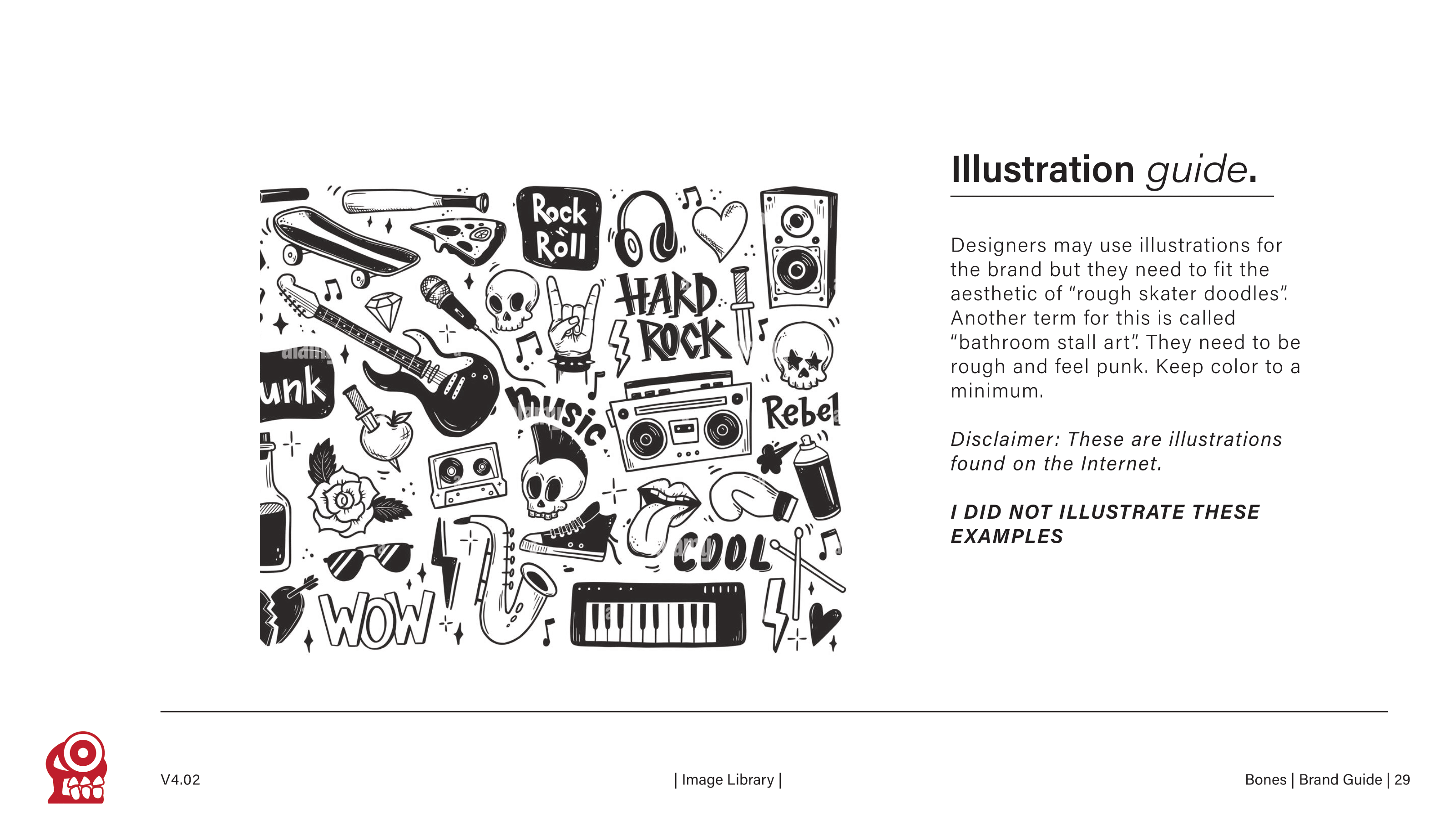
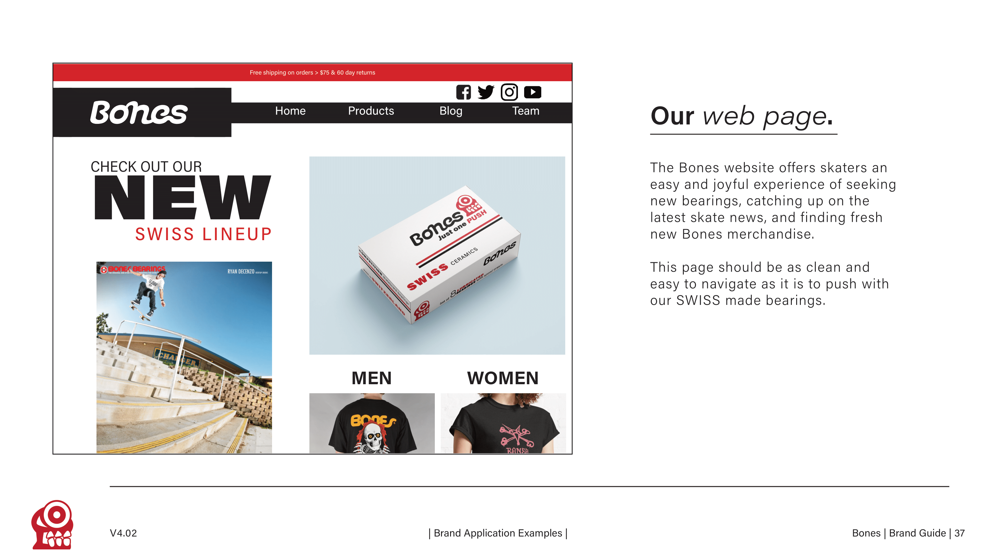
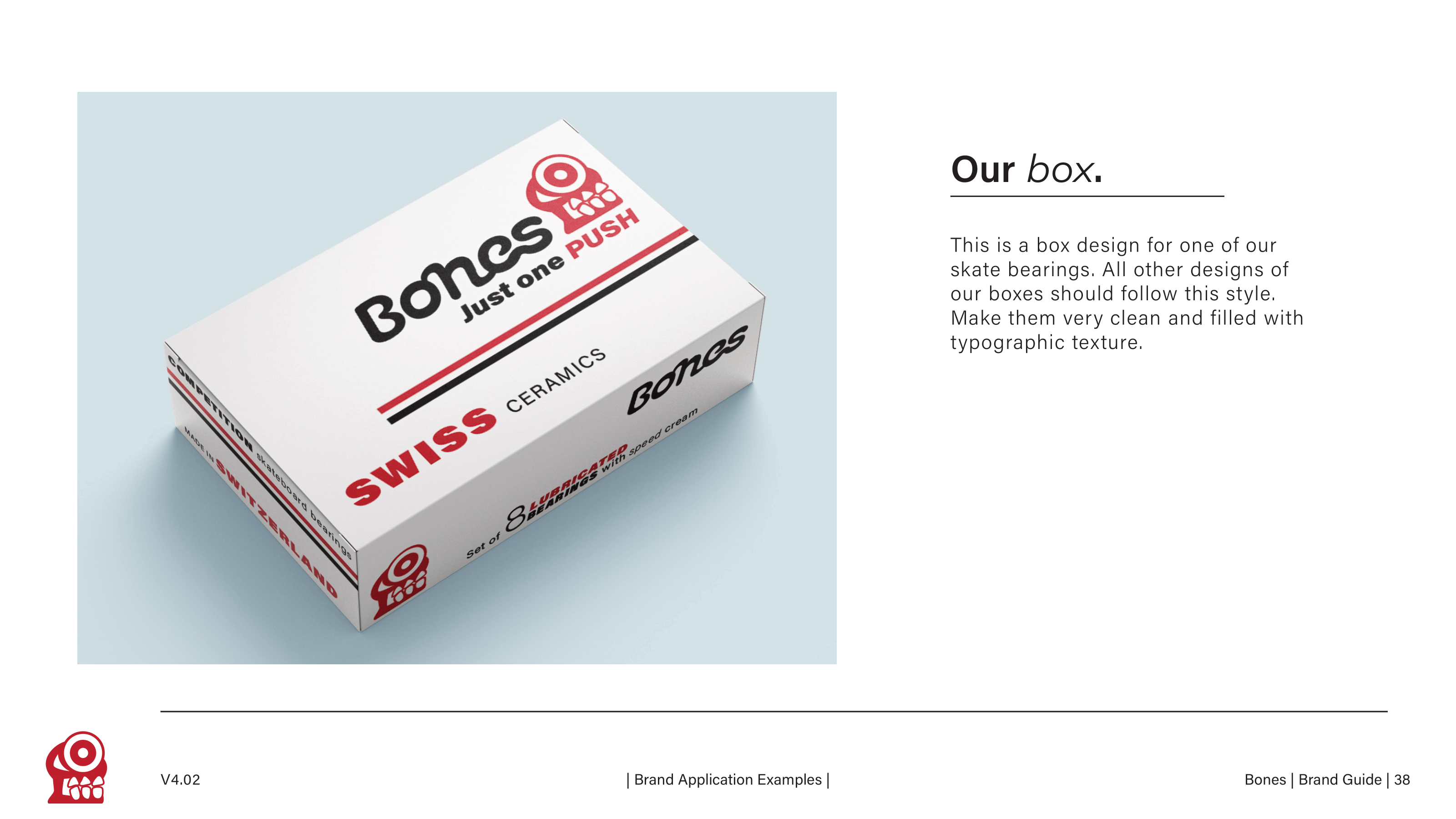
Here are some snap shots of the Style Guide I made for Bones. It is designed in the style of the brand so each page is an example of what their voice should look like. It is filled with rules and guidelines for future designers and ends with brand applications that showcases those rules in action.